


At three o’clock on Friday afternoon I received an email from Archway Publishing. Attached where three treatments for the cover and three for the interior of my novel. The world literally stood still for a moment. I walked outside and took a deep breath, my first thoughts were, once those images are opened there will be no turning back, my dream will be one step closer to fruition. And, the important thing to note is that the dream all along has been to complete and publish my story. Supporting myself as an author, writing a best seller, finding fame and fortune are by-products of an overactive imagination generated by fear of my unemployed status.
I opened the manuscript body files first, setting Adobe to display them as “two up continuous” and “show gaps between pages.” For the first time, my words looked like a book. Excitedly I slaughtered a few trees and printed out each version. There was so much to look at: typefaces, kerning and spacing, treatments of the page numbers, alignment of headers and footers. Suddenly, I had to refocus my eyes and let them just glide over a few pages to see what tripped me up and what made the page feel welcoming. The gentle use of Glyphs gives a finished but light-hearted sense. Left justified or centered? Header and footer placement for page numbers and such? I was sensing overload and walked away again.
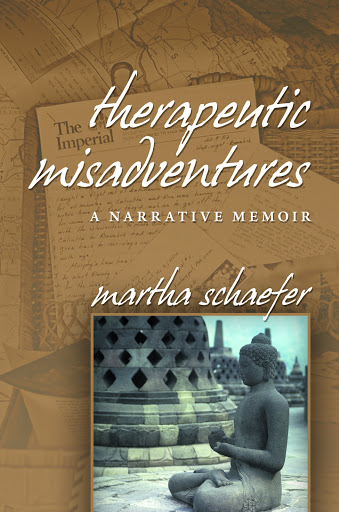
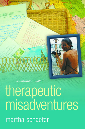
Back to the computer and load the cover mockups. The thumbnail-sized view first, just as it would appear on Amazon or Goodreads. Then I opened it to actual size as it would look on a shelf. What first caught my eye? Look away, clear my vision, then glance at each individually. I made it a determined process.
Later that evening, having printed out the covers, I sat down and threw reason to the wind. I picked up the two copper rods, and cleared my mind to dowse the covers. The three covers were shuffled and placed face down on a glass top table. I had my back to the table as I pictured the finished book instead of the cover choices. Turning, I approached the first sheet of paper. The rods swung wildly but didn’t stop in either a separated or crossed position; they just stood awkwardly swinging. I stepped back and took a deep breath. As I approached the second sheet, the arms of the rods began to swing and came to rest as a cross. On the third attempt, the arms stopped swinging as I held them over the last sheet. They came to rest perfectly separated.
OK, so much for a spiritual consensus. Next, I emailed my sister, Zanne, and my riding cohort, Lauren. They have lived with this ad nauseam for months so I figured why stop now? At first Lauren’s comments were guarded. I made her promise to be brutally honest if I brought hardcopies to the barn. Zanne and I spent Saturday morning on the phone going over theories of color and attraction, readability and personal preferences.
Early the next morning, a friend needed a ride to pick up a U-Haul truck. I figured she was a captive audience for at least fifteen minutes so before I pulled out of her driveway, I pulled out my folder. She had not read any of the novel and had not been inundated by my trials along the way. First the covers, I did my best not to seem like a new parent while someone inspects your baby. Her comments were fascinating and all based on who she is and what she reads. Bingo! An unbiased opinion.
Later that morning I headed to the barn to ride. I dragged my, by now dog-eared, folder with me. As we were all cooling out from the ride, I coerced Jen to come take a look and give me her thoughts. She knew only that I was working on a book. Her comments were, again, not what I expected but so insightful.
I tried to put it out of my mind for the rest of the day. I needed to stop seeing all the little parts and imagine the whole.
Back to the barn on Sunday. I wanted Lauren to see hardcopies and Steph was instrumental with her edits of the first round; their reactions and insight were crucial. I totally gave away my feelings…time to stop asking and solidify the decision myself.
The image that finally pushed me over the edge with my decision came late Sunday afternoon. I was reading an interview with the author, Sue Miller in the Boston Globe. There were two accompanying photos, Miller in her office and a shot of her bookcase. One book cover caught my eye in both shots. Only the spine of the book was visible but the color and composition stood out from all the rest. There was my answer.
 |
| Typeface needs work |

KInda like the second one….
LikeLike
Chris, thank you so much for your feedback! The colors look awful and there needs to be some work on the the typeface on both options. I am still formulating the details but this is really fun and scary. You don't get a second chance!
LikeLike
Martha!Like the second one! Reminds me of you. Can' wait to read it! Robin
LikeLike
I seem to be in the minority. I like the first one. The subdued colors give me a peaceful feeling about the book and the inset picture backs that up. It is as if writing this has given you peace. The second cover, with its bold colors, seem a bit chaotic to me. Although the bold colors are eye attracting, I think it takes away from what I think is the purpose of the book. Just my two cents
LikeLike
thanks Robin and Laura. I love hearing your input. Signed copies to you both when it comes out!
LikeLike
This comment has been removed by the author.
LikeLike
Saya suka nomor dua juga. Kamu memilih foto yang baik.
LikeLike
Terimakasih banyak, Anonymous! I would love to send you a signed copy when the book is published. Many more photos inside. Sorry, my Bahasa Indonesian is rusty!
LikeLike